Sales Analytics
Role: Head of Product Design & UX | Team with: Product Manager & Engineering | Duration: 6 monthsProduct Summary: B2B SaaS application in providing sales leaders performance-based ML metrics for informed forecasting.

The Business Problem
Sales leaders are required to make decisions constantly, and making decisions without the best possible data introduces risk and uncertainty which may lead to incorrect decisions and/or an inability to make decisions within a required timeframe.
The Goal
- Sales managers will leverage solution as part of normal processes.
- Minimal to no effort in collecting, organizing, and processing data.
- Minimal to no reliance on external systems outside of solution.
The Design Challenge
- Translating complex charts and tables into easy to understand and that actionable towards the Sales Manager.
- Providing real-time insights from both Salesforce and emails is challenging due to the need for constant data synchronization and timely analysis.
🕵️ RESEARCH
Methods and Skills used: User Interviews • Empathizing • Crafting Personas
I started off with conducting user interviews with sales managers such as Sarah. Sales managers like Sarah are on the front lines, interacting with her sales reps and prospects.
What is the most difficult part of your job being a sales manager?
How difficult do you find cross referencing your sales rep’s activities, pipeline, and data and making informed decisions off of their sales performance?
As a sales manager, what types of information are you looking to extract from your sales reps in helping you coach and win deals?

📝 DEFINE
Methods & Skills used: Crafting Problem Statements & User Stories
We want to clearly articulate the problem based off of user insights collected from our interviews. These are a few problems statements that were articulated from it.
Sarah, a busy sales manager, needs clear visibility into her team’s sales activity; without it, she risks missing financial goals.
Jane who is a productive sales executive who needs an application to make informed sales decisions of her team finds it very difficult to triangulate sales activity vs pipeline trends vs revenue creation. This is a problem because she’s opening different applicaitons making her workflow very cluttered and disorganized.

User Story
“As a Sales Manager in a mid-sized organization, I want to have access to relevant performance data for my sales team such that I can make faster, better-informed and more effective management decisions in order to optimize the financial productivity of my sales team.”
How Might We
take all these data points and provide the user an easy to understand data without having them spend so much time analyzing trends from other software applications?
We Need to
understand sales jargon, how Sales Managers’ like their data presented, and what delights them in making their role much more efficient and enjoyable.
🧠 IDEATE
Methods & Skills used: Figma • iPad • Sketching/Drawings • Conducting Workshop Sessions
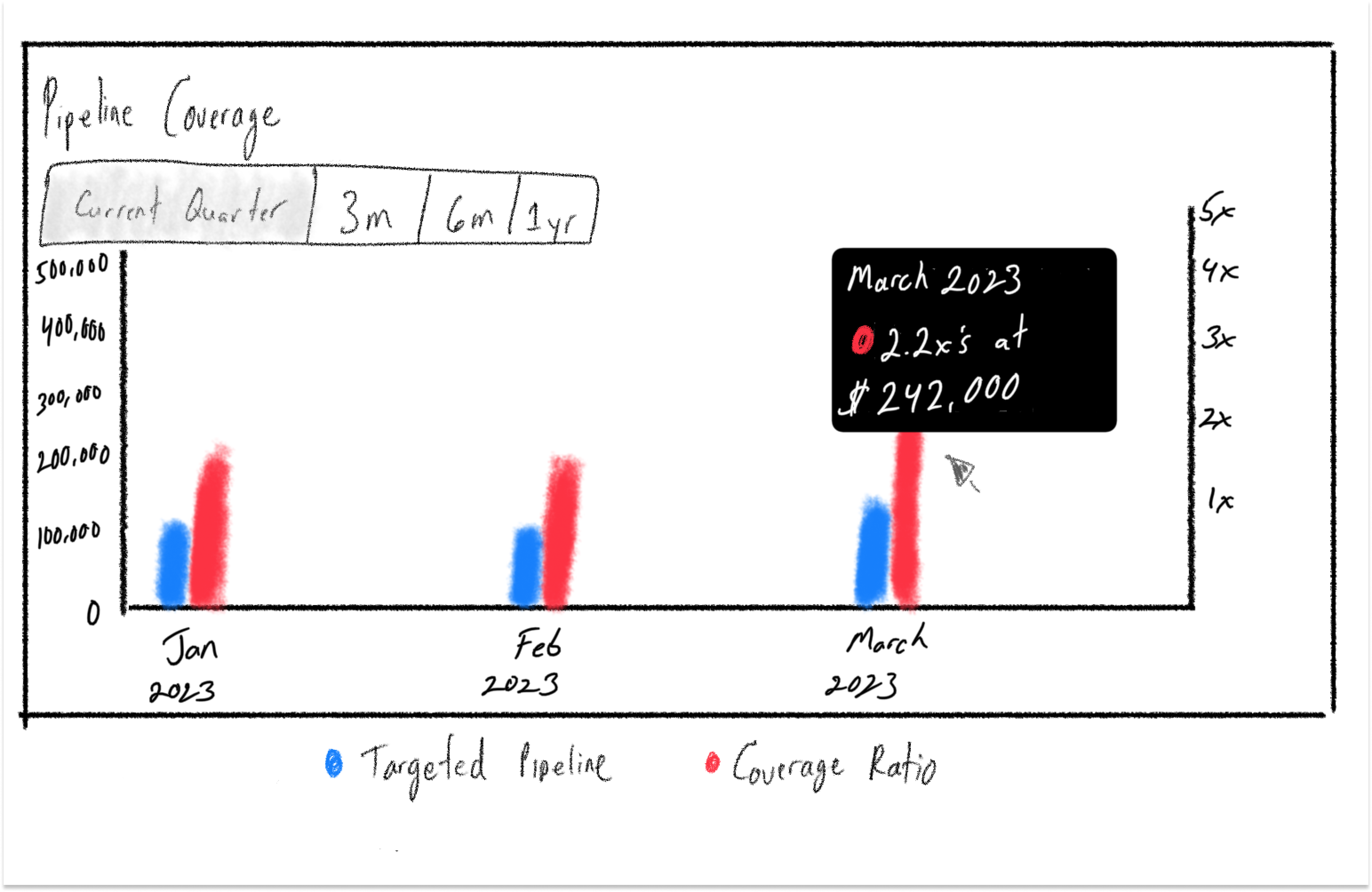
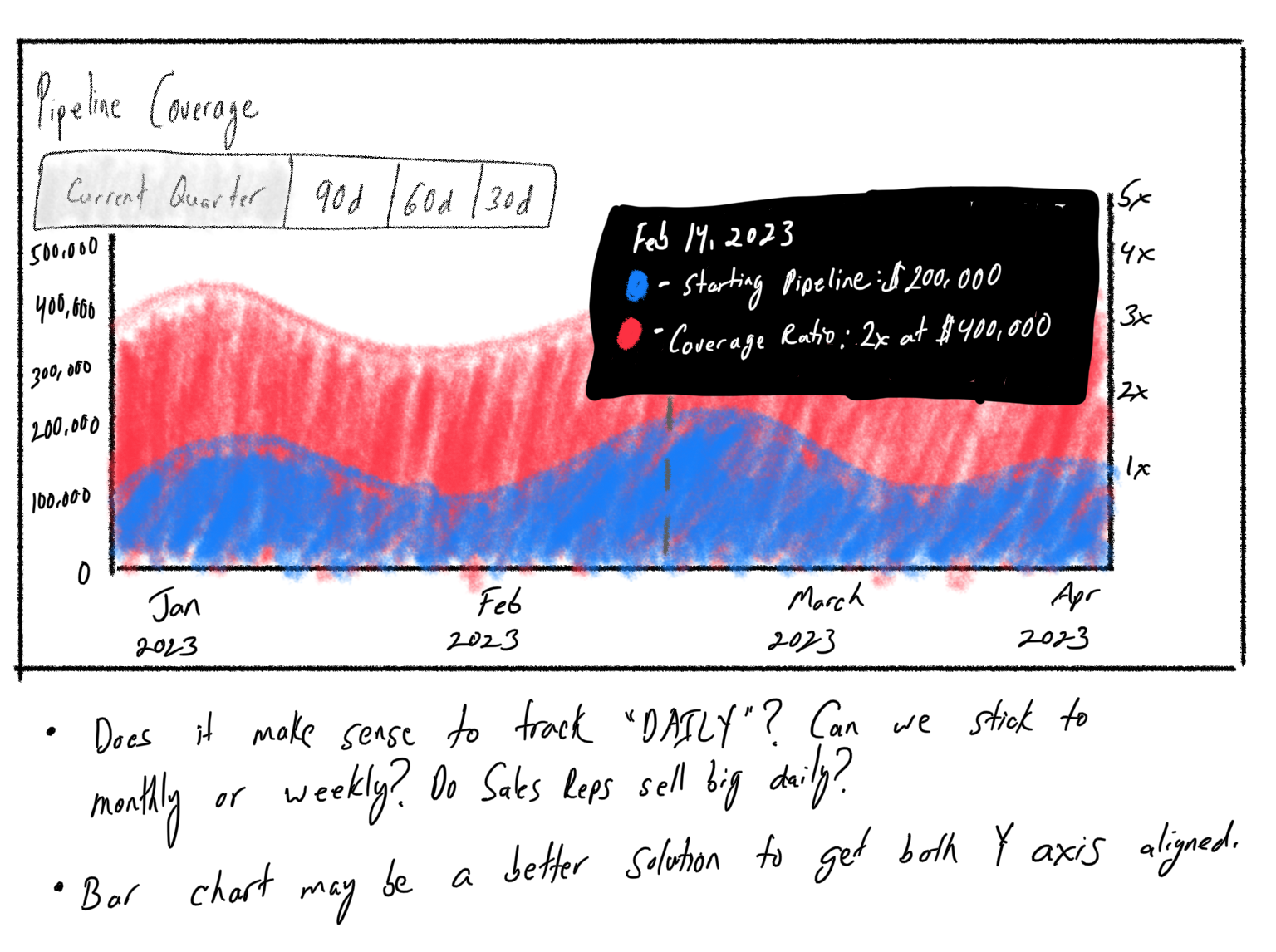
Concept Sketching
To grasp the Sales Manager’s requirements comprehensively, I sketched a visual representation of different charts and scenarios, delving into sales-specific terminology encompassing quotas, bookings, and pipeline multiplier.
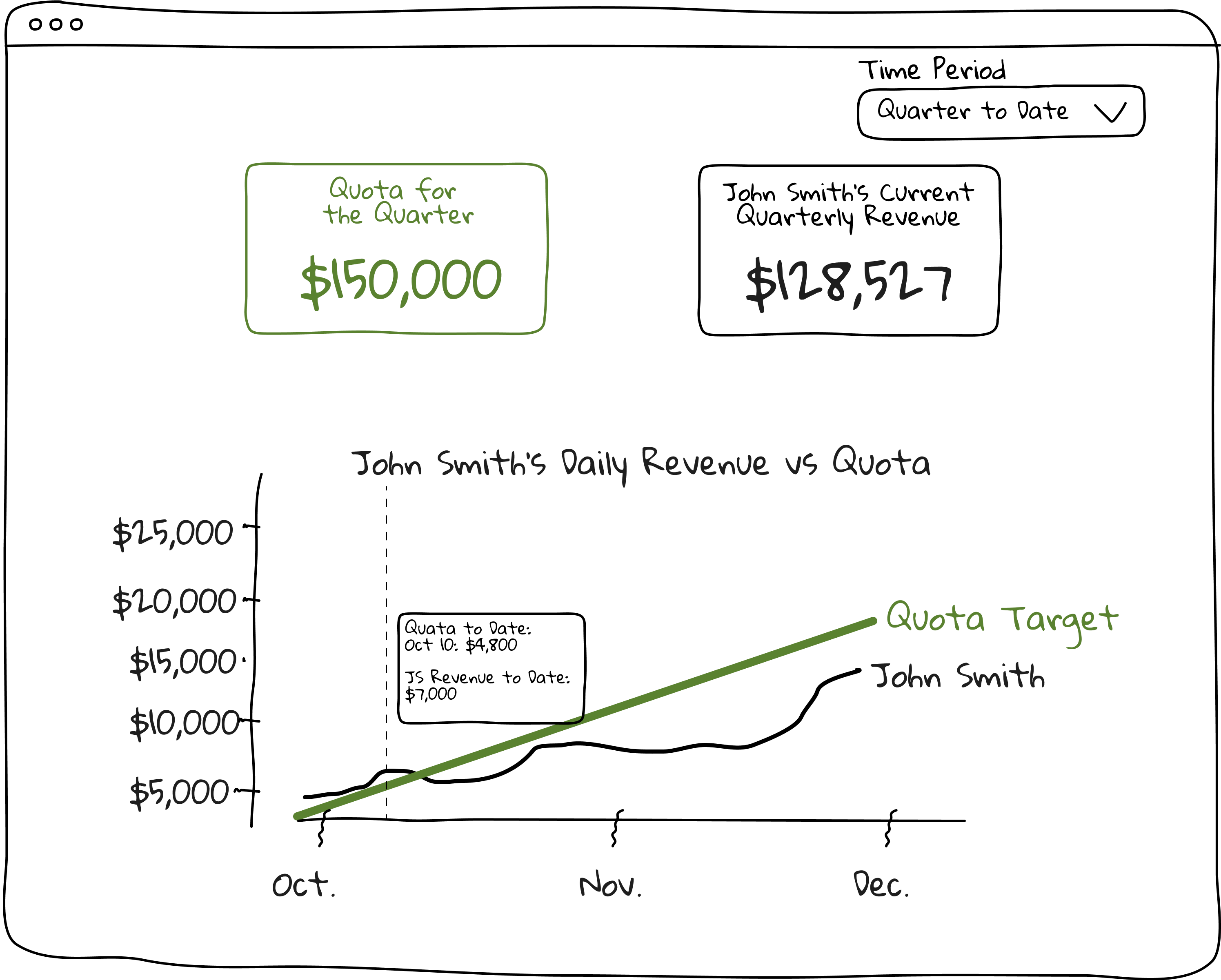
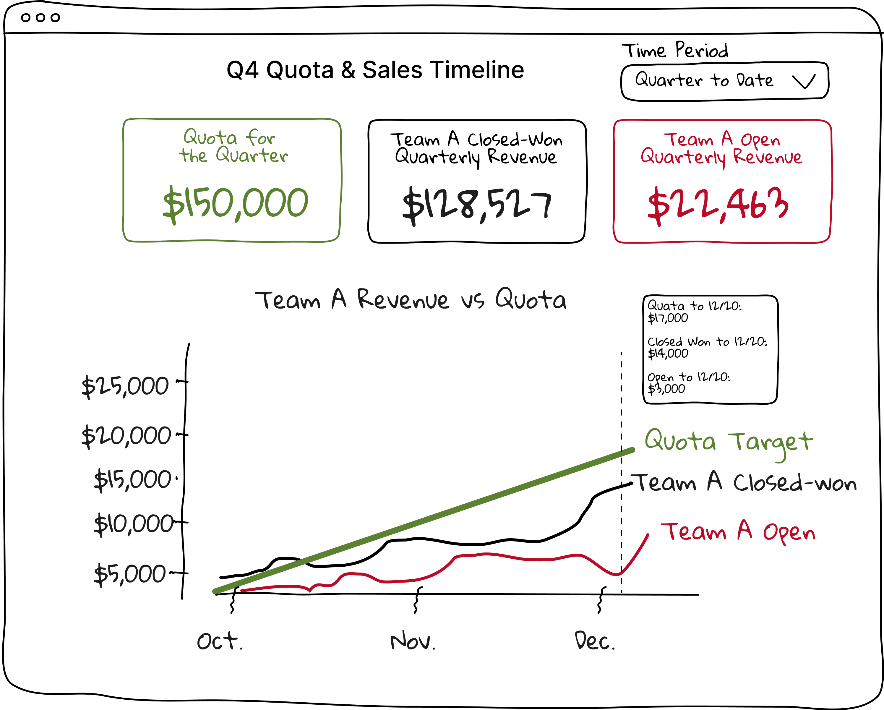
Low Fidelity
With the necessary insights at hand, we iteratively refined the charts and skillfully compiled them onto a single, cohesive page. Presented to the senior leadership, the page evolved from sketching to low fidelity, showcasing a meticulous and impressive transformation.

▶️ 💻 Prototype
Methods & Skills used: Figma • Prototyping • Design System
This is a tangible represention of the solution. Solving the challenge of ensuring the charts encompassed a user friendly solution that sales managers can clearly understand at first glance was quite the accomplishment. Hover over iFrame to reveal options to enlarge the prototype.
🔬 Test Results
Methods & Skills used: Gainsight PX, UserTesting, Zoom, Google Survey Forms
Prior to gathering test results the team decided that the UI must load in 3 seconds or less, have 100% of data be true, spend at least 10 minutes on the page, and have at least 3 interactions with the application in order to prove that this product is viable to proceed with developing it. This was tested with 50 beta users whom are current Cirrus Insight customers.
ACTUAL UI Load (On Average)
2.79 secs
Session Duration (On Average)
12.23 minutes
ACTUAL Data Accuracy with Salesforce & Mongo DB
100%
Content Interaction (Interactions to Minute)
5:1
Lessons learned
Figuring out what is Pipeline Multiplier: It’s a strategic approach used by sales managers or teams to increase the number of potential deals or prospects at various stages of the sales pipeline. For example if the sales goal is to make $1M at the end of the quarter, their pipeline really needs to be $3M. That is a pipleline multiplier of 3X.
Importing a Team from Salesforce: During the onboarding process (not shown here, please request to view), instead of manually searching and inputting your team members, Salesforce can actually import a team via API making the onboarding process faster and smoother. This should be considered as an enhancement.
Related Projects

Dashboard Redesign – Redesigning a dashboard isn’t just slapping on nicer fonts and color, it’s identifying the problem in the first place that makes it all worth the redesign.

Stratosphere Design System – Design rules and components that empower designers and engineers to quickly construct clean and scalable apps with ease. View Figma File or View it Live Online
Photography
Weekday Evenings
7PM -10PM
Weekends
1 PM - 11 PM
Contact
Phone
+(562) 552 2526
info@michaelserna.design
Address
Riverside, California