Dashboard Redesign
UX Research | Product DesignerSeamlessly integrating email open analytics and meeting tracking, all while empowering you to tailor your workflow for optimal efficiency.
Business Problem
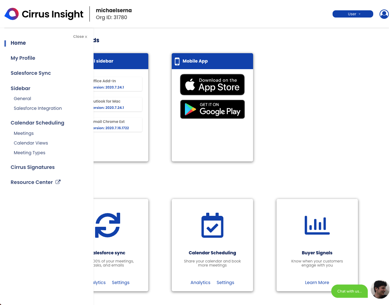
The dashboard represent the foundation of how users’ workflow begins. Users frequently encounter difficulties when attempting to decipher the presented data, as the cluttered layout and confusing data visualizations impede effective comprehension resulting in increase amounts of churn rates and revenue lost.
Why It’s a Problem
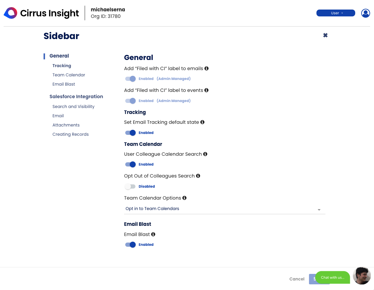
The current dashboard, characterized by its complex layout, convoluted data presentation, and cumbersome navigation, has led to significant difficulties in both readability and operability. Users have consistently expressed frustration due to the lack of intuitive design elements, resulting in an overall negative user experience.
The Goal
The redesign initiative is driven by the aspiration to cultivate a dashboard that not only presents information effectively but also empowers users with a seamless and intuitive experience. The proposed changes are expected to enhance user satisfaction, increase adoption, boost productivity, and contribute positively to the overall utility and value of the dashboard.
Key Performance Indicators (KPI)
Daily Active Users (DAU) within the next quarter
15% Increase
Support Calls within the next quarter
20% Decrease
User Interviews
Cluttered Interface: Some users have reported that Cirrus Insight’s interface can feel cluttered and overwhelming. The integration of various features and functionalities could lead to a crowded display, making it difficult for users to quickly find what they need.
Non-Intuitive Navigation: If the interface lacks clear navigation paths and intuitive design, users may struggle to find and use specific features. Non-intuitive navigation can lead to frustration and decreased efficiency.
Inconsistent Design: Inconsistencies in design elements, such as buttons, icons, and color schemes, can make the interface look disjointed and unpolished. A cohesive and consistent design is essential for a positive user experience.
Overwhelming Options: If there are too many options, buttons, or menus without proper organization, users might feel overwhelmed and unsure of which actions to take. This can lead to confusion and errors.
Unresponsive Elements: An unresponsive or laggy interface can frustrate users who expect quick and smooth interactions. Slow response times can disrupt workflow and hinder productivity.
User Stories
Streamlining Workflow As a sales representative, I want a newly designed dashboard in Cirrus Insight that streamlines my workflow by providing quick access to essential information. I want to see a consolidated view of my upcoming meetings, tasks, and emails related to my leads and opportunities. This would allow me to prioritize my tasks effectively and ensure I never miss an important interaction.
Data Visualization for Insights As a sales manager, I need the new dashboard to provide insightful data visualizations. I want to see key performance metrics such as lead conversion rates, deal pipeline stages, and team performance. Having these visualizations in an easily digestible format will help me make informed decisions and identify areas for improvement without digging through multiple reports.
Customizable Widgets As a marketing professional, I require a customizable dashboard in Cirrus Insight. I want to be able to add and arrange widgets according to my specific needs. Whether it’s monitoring social media mentions, tracking email campaign performance, or viewing website analytics, the ability to customize my dashboard will enhance my ability to manage and measure marketing efforts.
New Designs
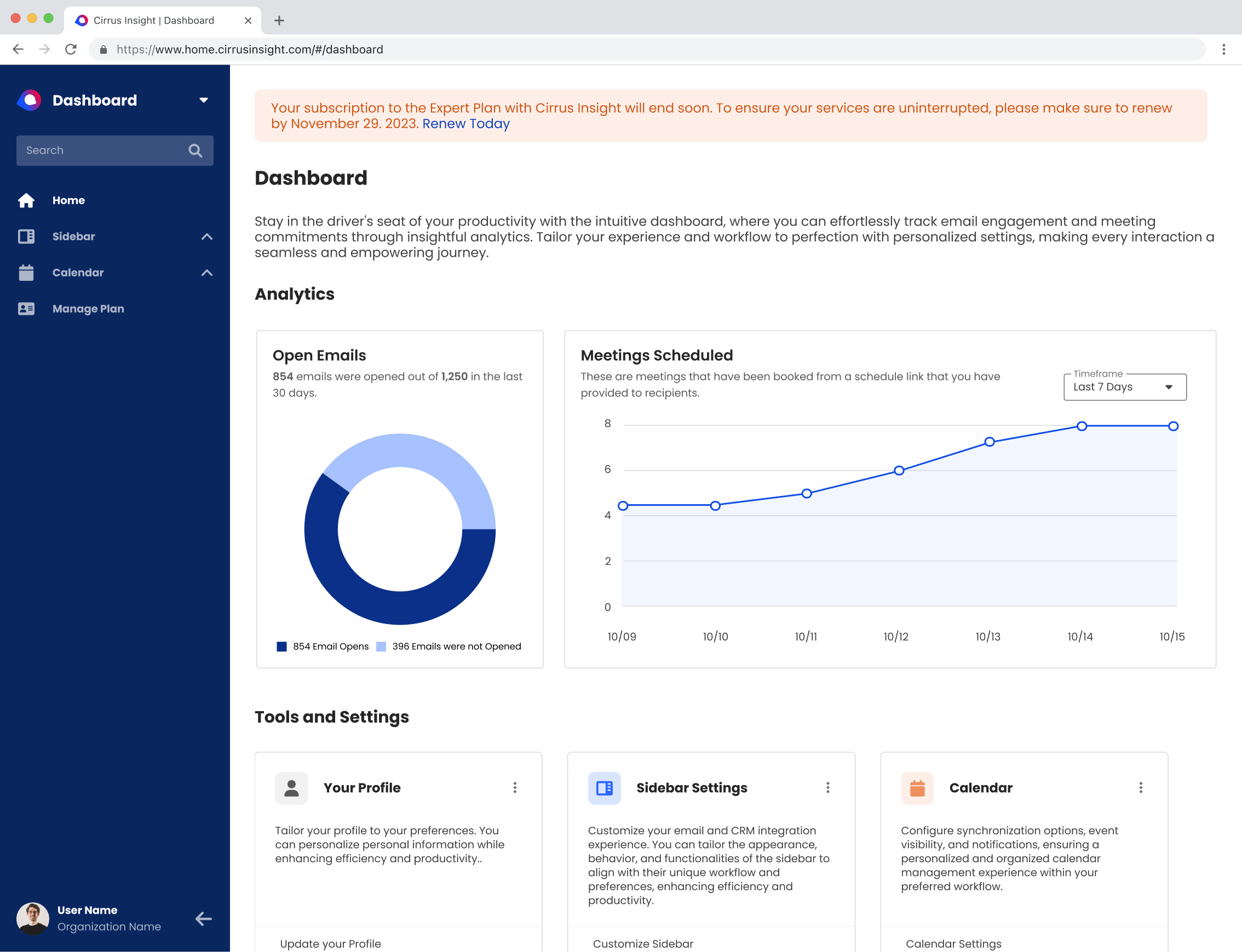
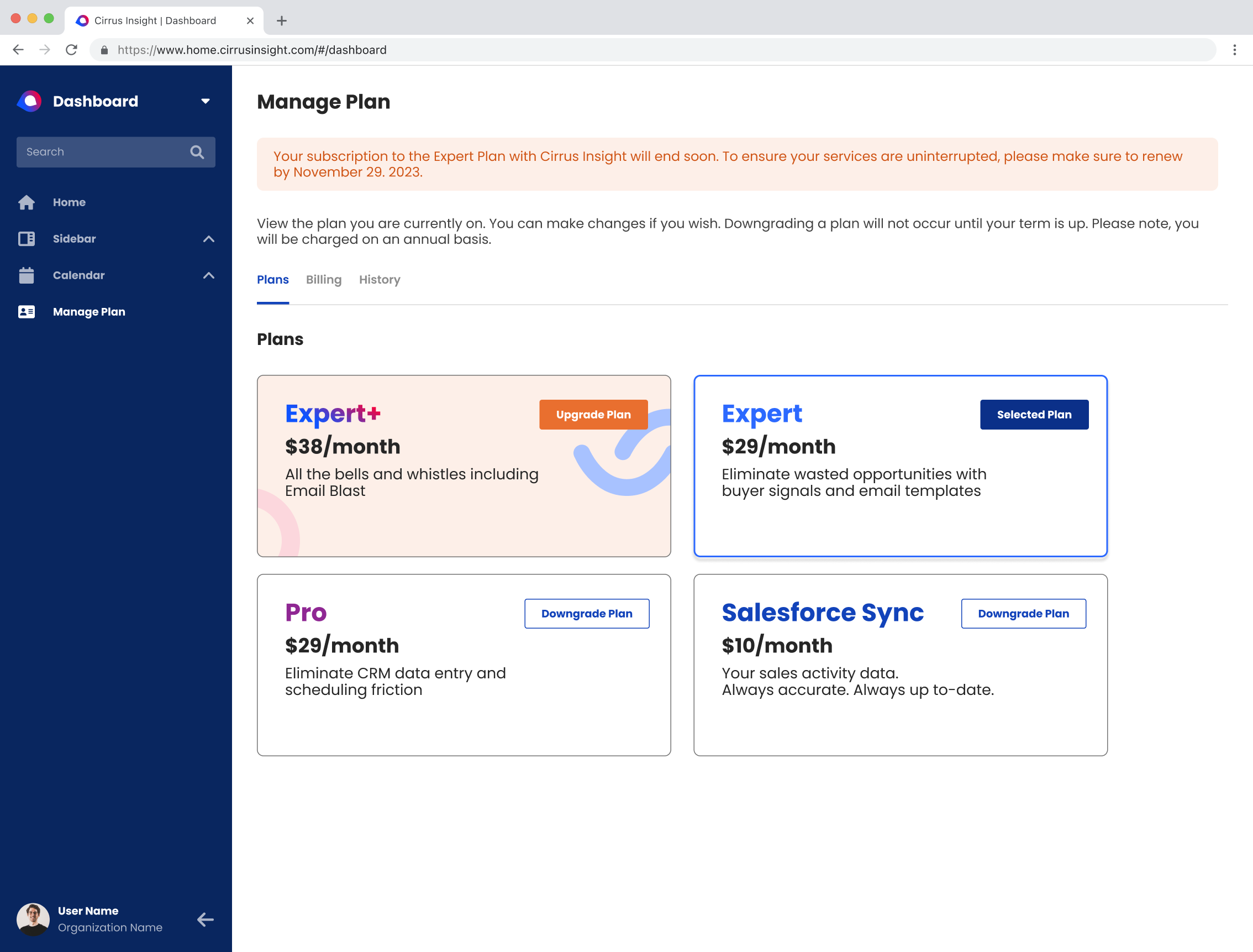
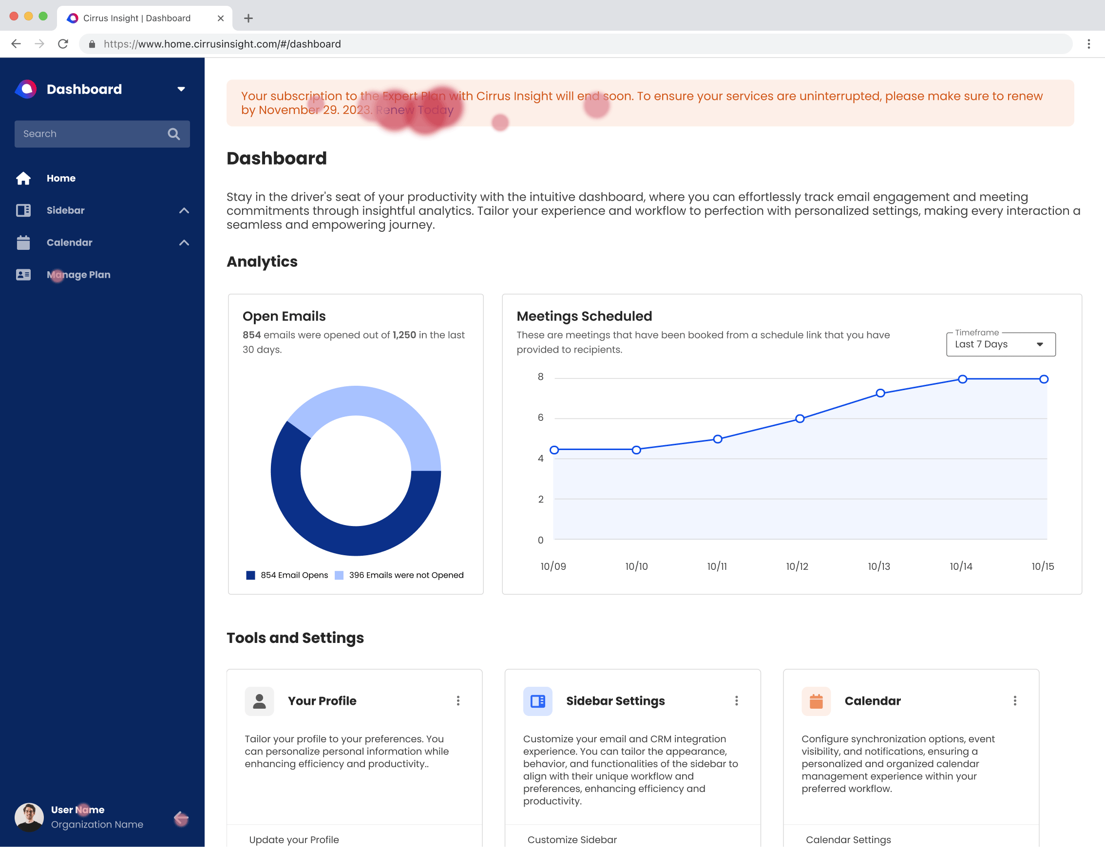
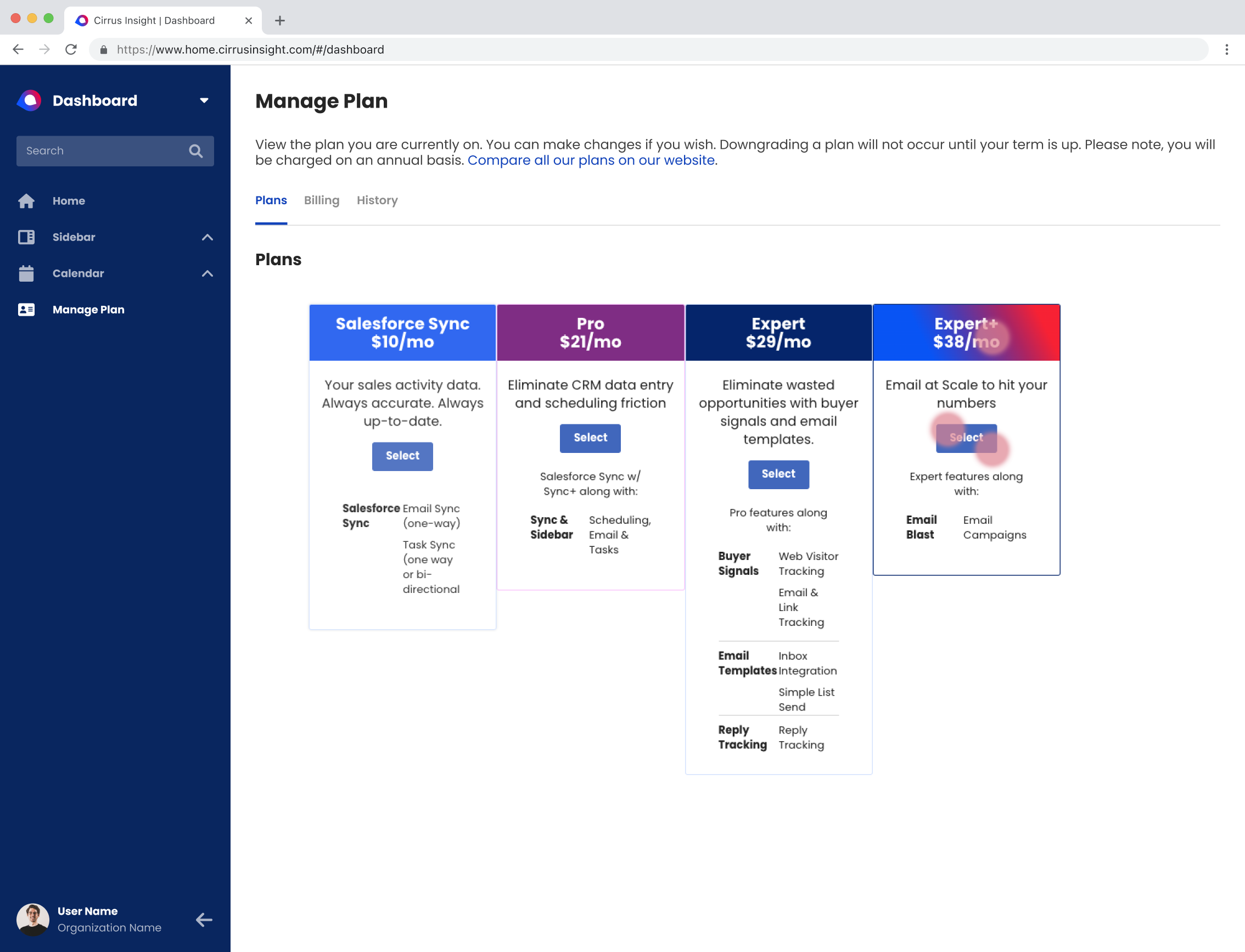
The dashboard redesign introduces a collection of sleek user interface elements seamlessly integrated from the design system. With a unified sense of consistency throughout, users can confidently expect an elevated level of efficiency and user-friendliness in their workflow.
A/B Testing
We conduct A/B testing on two distinct screen variations, aiming to gauge the probability of user interaction that leads to successful sales conversion. The test was made out of 50 users who actively use Cirrus Insight.
Design A
64% of users chose Design A – 32 out of 50 users clicked on Design A and within the right area of where the renewal experience would be taking place.
Design A
3% of users chose Design A – 3 out of 50 users clicked on Design A within the correct area of where the upgrade experience would be taking place.
Design B
20% of users chose Design B – 10 out of 50 users clicked on Design B within the correct area of where the renewal experience would be taking place.
Design B
97% of users chose Design B – 47 out of 50 users clicked on Design B and within the right area of where the upgrade experience would be taking place.
Results of Dashboard redesign
After the redesign was implemented, we tracked metrics of users using the dashboard (after 30 days). We also had weekly meetings with the support team on the level of interactions with customers allowing them to focus more on advancing better onboarding user experiencing without our applications.
ACTUAL Daily Active Users (DAU) within the next quarter compared to last quarter
34% Increase
ACTUAL Support Calls met within the next quarter compared to last quarter
35% Decrease
Photography
Weekday Evenings
7PM -10PM
Weekends
1 PM - 11 PM
Contact
Phone
+(562) 552 2526
info@michaelserna.design
Address
Riverside, California

