Herbalife Nutrition
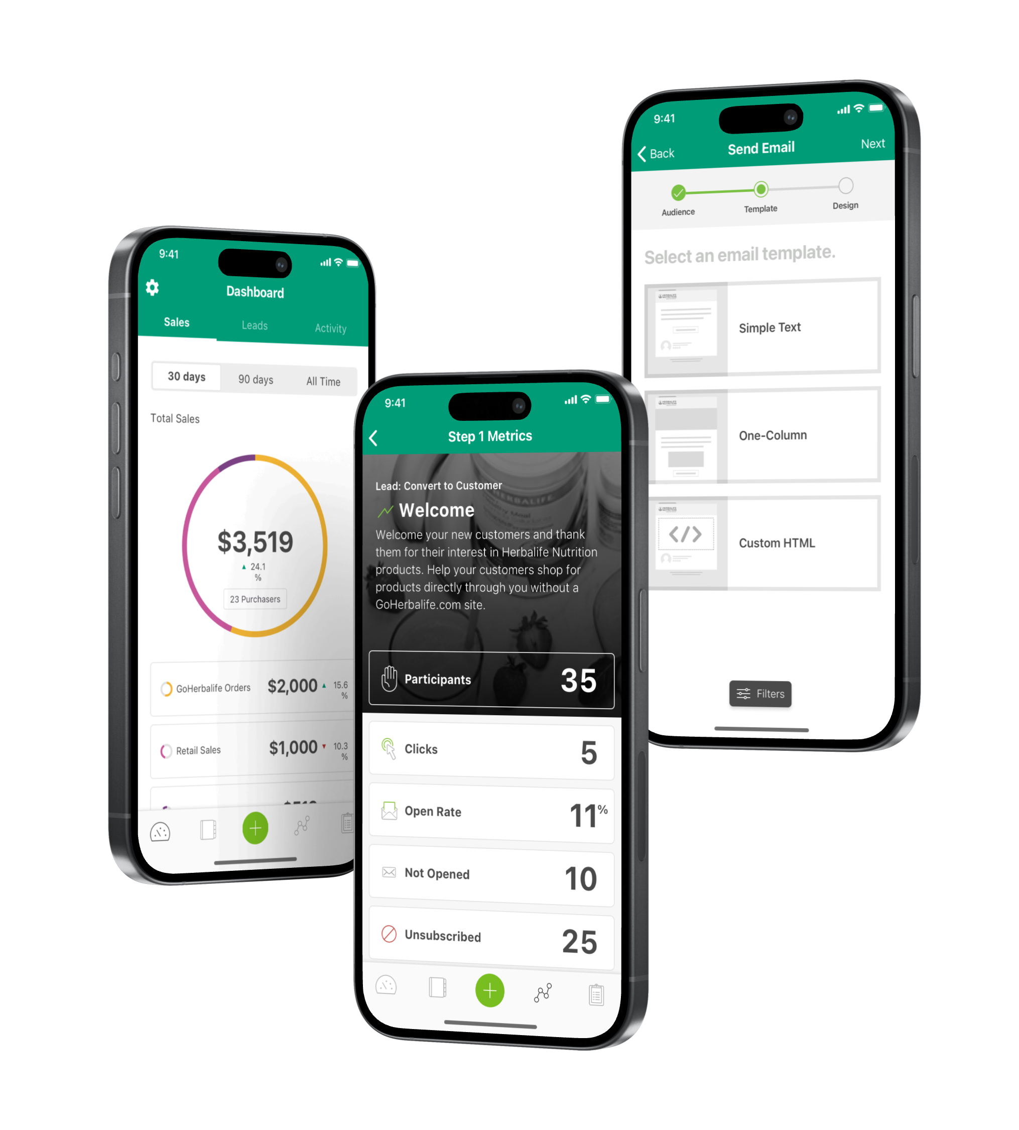
Role: UX & Visual Designer | Team with: Product Managers & Developers | Duration: 1 yearProduct Summary: B2B/B2C SaaS application that manage contacts and leads, notifies profit, and empower users on a seamless automated sales journey from the palm of the your hands. Data is pulled from Salesforce and is executed to a easy-to-use application.
The Business Problem
The health and wellness industry is highly competitive, with numerous players offering similar products. The market may have reached saturation, making it challenging for Herbalife Nutrition to differentiate itself and capture new customers. Competitors might have introduced innovative products or adopted aggressive marketing strategies, diverting market share from Herbalife Nutrition.
The Goal
With a smartphone application, users should be able to track sales and revenue onto an online dashboard from their desktop or mobile device. Users will also rely on smart notifications to ensure that sales distributors are actively selling Herbalife Nutrition products
The Design Challenge
- Designing for a native desktop app and mobile application.
- Ensuring that there is data and UX consistency accross both desktop and mobile platforms.
🕵️ Research
Methods & Skills used: User Interviews • Crafting Personas
I’ve conducted user interviews with sales distributors in ensure design and UX are being validated for successful product adoption.

Alex, 29, Sales Distributor
Alex is a sales distributor and certified personal trainer who operates independently, providing one-on-one coaching and specialized fitness programs. They work with clients both in-person and online.
As a Sales Distributor, it is very difficult to track sales and revenue. This is a problem because I’m having to navigate between different applications in order to operate sufficiently.

Jane, 25, Sales Distributor
Jane’s main goal is to retain existing members and attract new clients. She uses the CRM (Hubspot) to send personalized emails, offer promotions based on client activity, and create targeted marketing campaigns.
It’s difficult to email my leads because the emails aren’t branded. This is a problem because my contacts don’t trust my emails and delete them.
Comparitive Research and Inspiration
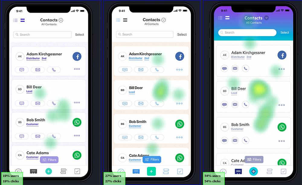
Upon conducting user interviews we found out that many current users utilize MailChimp as their go-to app in sending out custom e-mail campaigns to their customers.
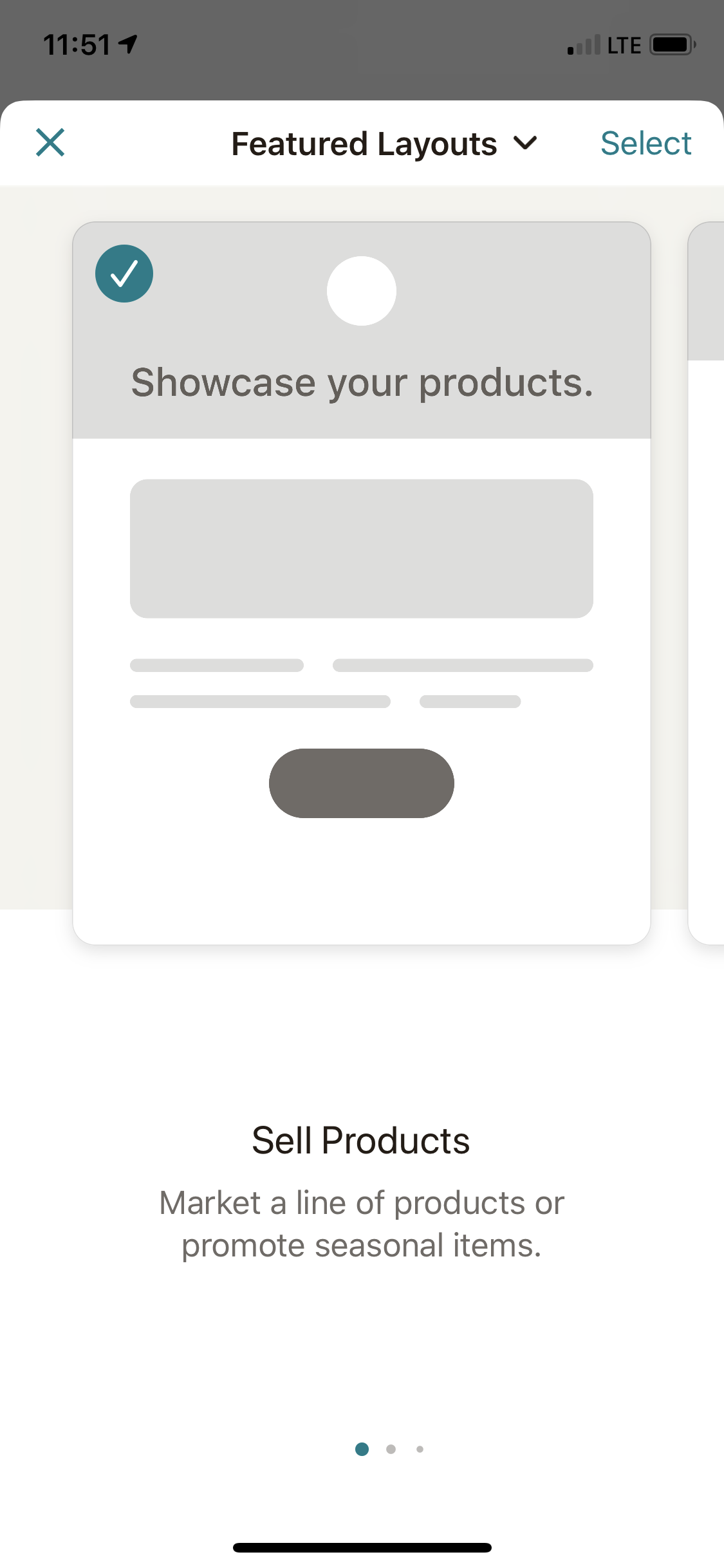
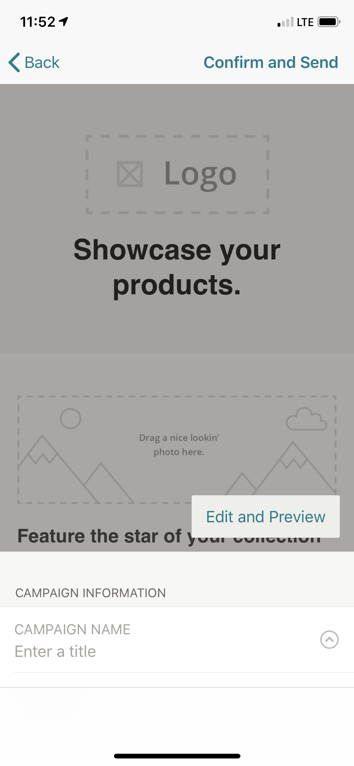
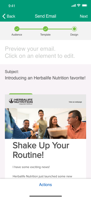
We observed how MailChimp’s e-mail platform is designed and built. I used it as inspiration to create Herbalife’s standard e-mail template feature.
The images were screenshots from MailChimp’s mobile app. See how we took the UI and the UX and create it for our user base.
📝 DEFINE
Methods & Skills used: Crafting Problems Statements & User Stories • Gather & Synthesize Insights
Main Problem Statements
We want to clearly articulate the problem based off of user insights collected from our interviews. These are a couple problems statements that I was able to synthesize from my interviews with users.
The problem is distributers don’t have an online mechanism to track online sales or lack thereof. This is a problem because they have to manually input their sales in an online spreadsheet or similar application such as Quickbooks.
The problem is distributors are sometimes not motivated; they need help and accountability to push themselves in being proactive in reaching out with customers. This is a problem because distributors are not empowered to sell product.
The problem is distributors don’t have a way to personalize corporate emails. It is a problem because corporate emails do not sound personalized.
Additional Problem Statements
- The problem is sending plain text emails. It is a problem because it doesn’t look professional.
- The problem is users cannot choose an appropriate type of email (plain vs. branded vs. marketing). It is a problem because choosing the appropriate email type allows the distributor to “dress for the occasion.”
- The problem is Herbalife has already created many Journey emails, but doesn’t allow the distributor to personalize them. It is a problem because distributors want Journey emails to feel like they are coming from them.
- The problem is distributors are not designers; they need Herbalife’s help to look professional. It is a problem because they want to send their own content but don’t have a good way to do so within HNconnect.
- The problem is distributors cannot currently save an ad hoc email. It is a problem because re-entering the same content is very manual and time consuming.
- The problem is distributors cannot add there own images to ad hoc emails. It is a problem because users want to personalize their email communication with their own imagery.
- The problem is distributors do not receive recommended messaging. It is a problem because user do not know what to send to their contacts.
How Might We
build an application that will be catered towards tracking sales and become an automated communication solution? Especially to those whom are not marketing savvy.
We Need to
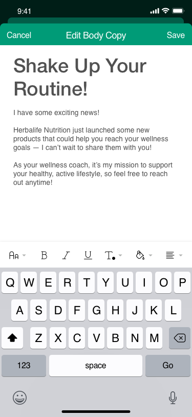
create the ability oversee a dashboard of all their sales and contacts as well as have the ability to email contacts using suggested content that is editable by the user.
User Stories
“As a sales distributor, I would like to send Herbalife branded emails, so that my customers can know it is an official branded Herbalife Nutrition email.”
“As a sales distributor, I would like to upload and use my own photos so that customers can see that it is personalized by me.”
🧠 IDEATE
Methods and Skills used: Conducting Workshop Sessions • Whiteboarding • Brainstorming Ideas & User Journeys • Concept Sketching • UserTesting
Conduct Workshop Sessions
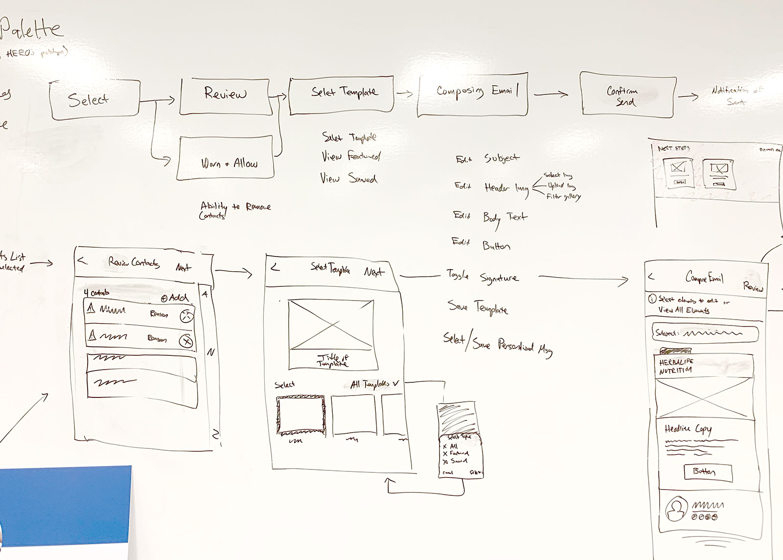
Workshops bring together various stakeholders—designers, developers, product managers, and even users—to collaborate. On this video, my team and I brainstorm ideas by doing some affinity mapping and sketching out some user flows.
User flow
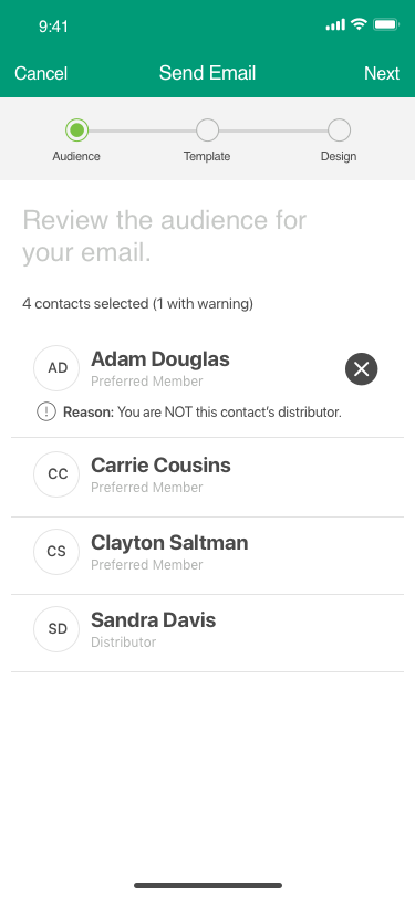
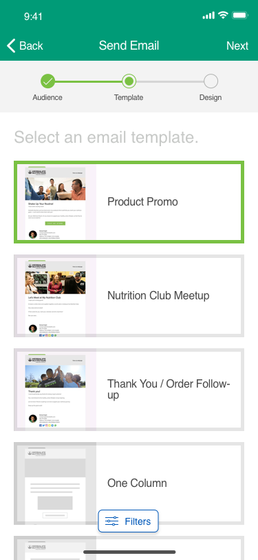
The schematics for a mass email distribution application traditionally start from selecting your contacts. Proof reading and selection of a design template are neccessary means of crafting emails that are geared towards selling a product or service. Not only a flow is drawn out here but we also draw low-fidelity wireframes in making sure product owners are on the same page as the designers.
▶️ 💻 Prototype
Methods and Skills used: Sketch • InVision • Interactive Prototyping
After gathering the flows, I’ve crafted a prototype that closely simulates the envisioned functionality of the application. It begins at the contact page, allowing navigation through the dashboard, journey, and the creation of marketing emails. Using Sketch and importing into InVision, I’ve orchestrated this process. Collaborating with a team of designers, we meticulously collected feedback on flow, interaction design, and screen orientation. The prototype is also used to gather feedback with our end-users for validation and feedback. Due to InVision being sunsetted, that prototype is no longer available. I will be posting a video of its simulation at some point.
🔬Test
Methods and Skills used: Quantum Metric • Survey Monkey
These are the results that were gathered from our testing and surveys. Testing was done with 2,000 users who actively are Sales Distributors with Herbalife Nutrition. Actual usage would need to reach 80% of successful registration, an NPS score of 70%, a conversion 50% of email sends, and 2 million dollars in sales to consider successful and profitable.
Registration Met
82%
Email Sends through the App
79%
NPS
91%
Sales
$2.5M
🔬Design System
Methods and Skills used: Sketch • Zeplin
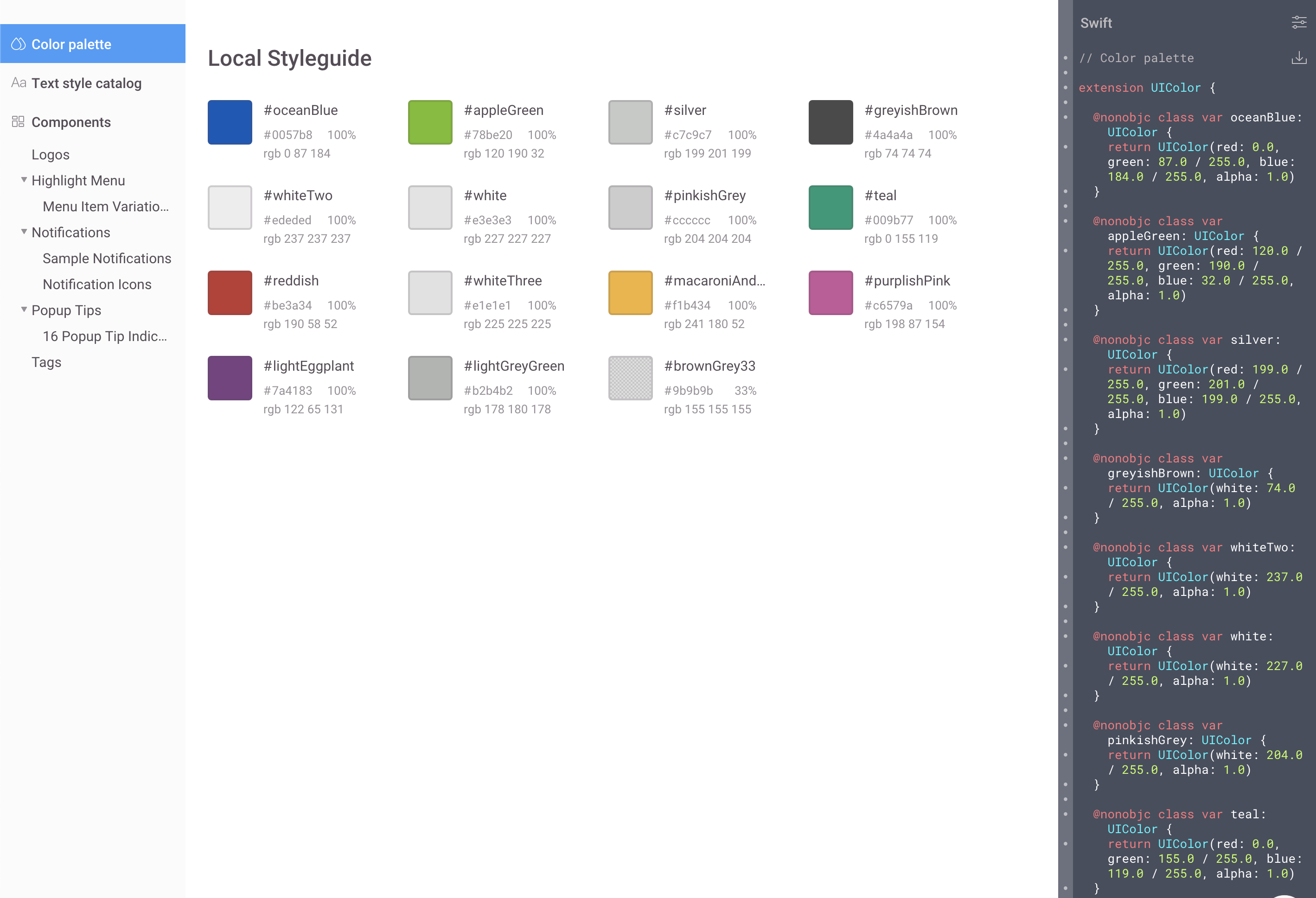
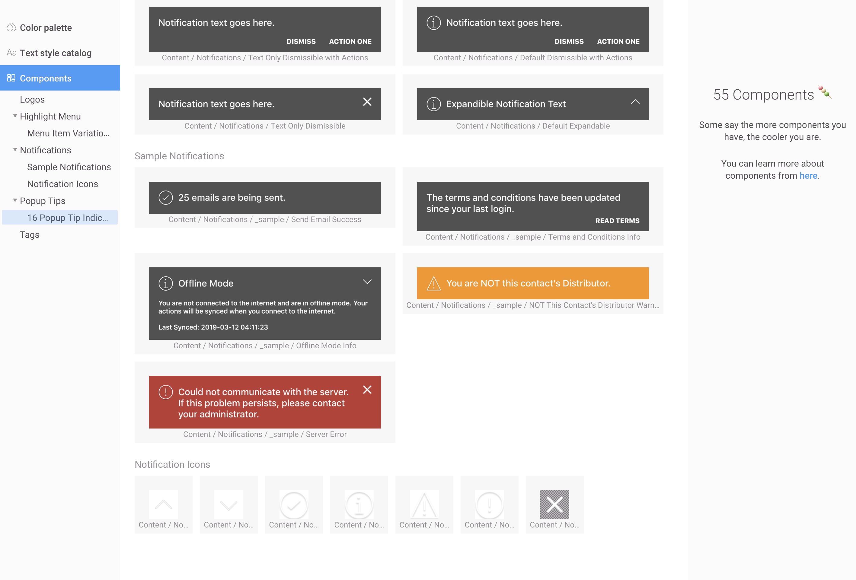
Here are just a few of the patterns and UI components that were made and used for the application. These were created from Sketch and exported onto Zeplin for developers to reference from.
Photography
Weekday Evenings
7PM -10PM
Weekends
1 PM - 11 PM
Contact
Phone
+(562) 552 2526
info@michaelserna.design
Address
Riverside, California

